We are excited to launch a refreshed corporate identity, including a new logo, new website and a change to our name. Our new look builds on the heritage of our past but with a fresh and contemporary look and feel.
Although our formal business name remains Frontier Advisors Pty Ltd, we’re now going to call ourselves Frontier, rather than Frontier Advisors. Of course we still offer advice to our clients but we now offer much more as well, whether that be assistance in identifying opportunities and broader business strategy matters, or technology solutions to help inform decision-making and power internal teams analytical efforts.
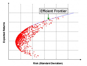
Our name, Frontier, represents what we do for our clients. We help them position their portfolios on the efficient frontier. Reaching the location of the highest expected return for a given level of risk for that investor.
Our symbol mimics the shape of the efficient frontier and the distribution of possible risk and return combinations more broadly. The curves in our logo show movement and growth along a path rising from an origin.
The curves also form the letter F, for Frontier.
The symbol draws inspiration from the original Frontier logo in its base colour of orange and its efficient frontier shaped curve.
Frontier CEO Andrew Polson explains the basis for the new visual elements of the Frontier brand.
“We wanted all the visual elements of our brand to match what we believe our brand offers more broadly. At Frontier we roll our sleeves up and find new and creative solutions for our clients. We are modern and professional, yet approachable and modest. Confident in our place as Australia’s leading asset consultant.
“We are more than advisers. We work alongside our clients to uncover opportunity, identify and manage risk, deliver efficiencies and develop technology. We are business partners.”


